- Published on
My designs from 2016 to 2020 as a non-designer
- Authors

- Name
- Alexandro Martinez
- @alexandromtzg
I've been a developer for almost 9 years, but I always found designing to be tedious work. These are my application designs since 2016.
From text applications and Winforms to functional Vue + TailwindCSS components.
2016 - Migration from 4GL to Winforms
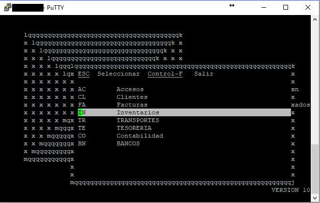
My dad has this legacy application written on 4GL that looks like this:
4GL application
I was still in college when we decided to migrate every .4gl program to desktop Winforms with C#. It was a bad decision, I know, we should've taken the web route.
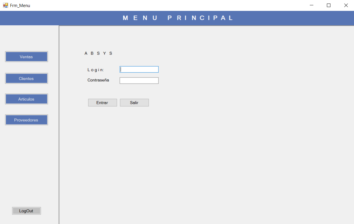
The first application concept looked like this:
My ERP application v0.1 - I know, ugly as hell:
At least we knew the migration wouldn't be as difficult as we thought it'd be.
2017 - Improving the desktop home screen
There were about 450 forms that needed to be migrated, so I needed a useful sidebar. I tested a few home screens before I was satisfied with it.
v1.0 - Feature-based sidebar and a few links of most used forms/features:
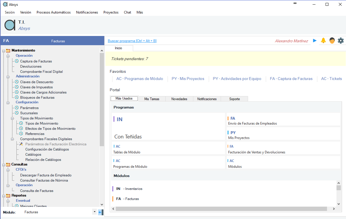
v1.5 - Module-based sidebar and section details of selected module:
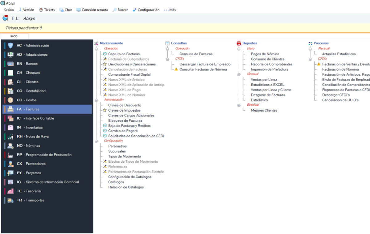
2018 - Added business intelligence dashboards
v2.0 - Role-based instead and I added a business intelligence dashboard:
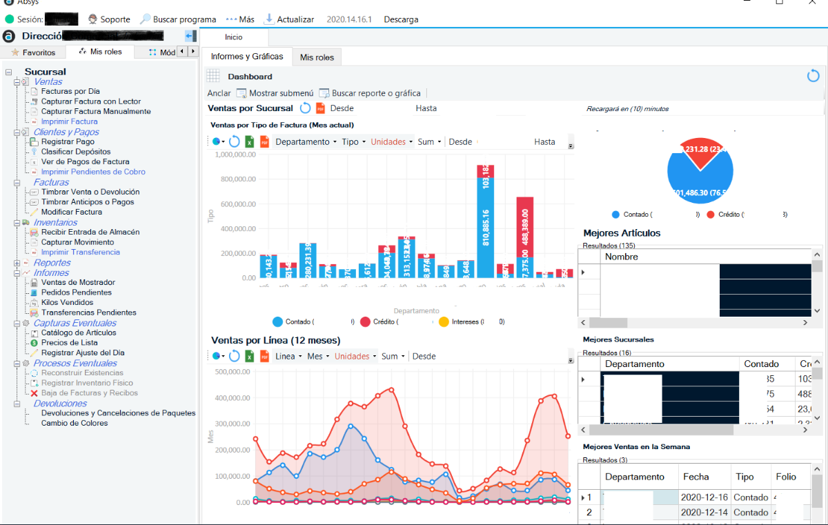
This is the desktop design that stayed, the sidebar menu and dashboards are generated based on the user's role.
2019 - My first attempt to design on the web
We had a few clients requesting the ability to place orders on their phones, so I prepare myself for web development.
I used VueJS and Bootstrap Vue to create a simpler version of the ERP we built on desktop.
Web v1.0 Only for certain roles such as CEO, Supplier, Seller, and Customer
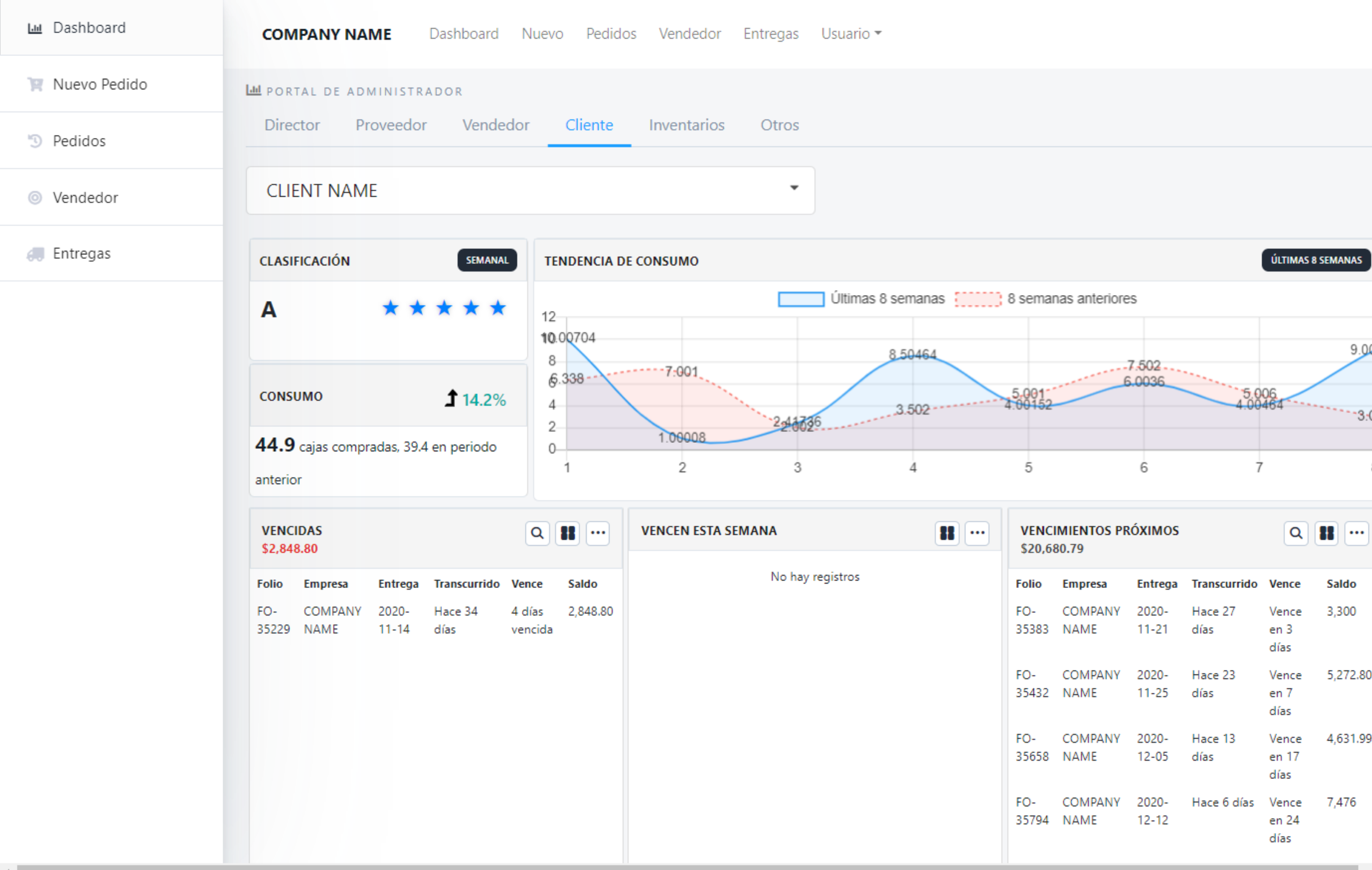
I had to look for something else, although I loved working with Vue.
2020 - Tailwind CSS motivated me to become a better designer
Since COVID started, I decided to start working on side projects. This SaaS idea came to mind and I wanted to develop it as quickly as possible. But I wanted to use a utility-first framework.
So before I wrote any code, I bought TailwindUI, copy-pasted the components I needed, and adapted them to my needs.
Once I was satisfied with this awesome framework, I started working on a project called NetcoreSaas, a boilerplate for SaaS application development with .NET, Vue (TypeScript), and Tailwind. I coded some common SaaS must-have features, such as authentication, multi-tenant, multi-language, multi-theme, multi-database, and more.
Landing page - Marketing side:
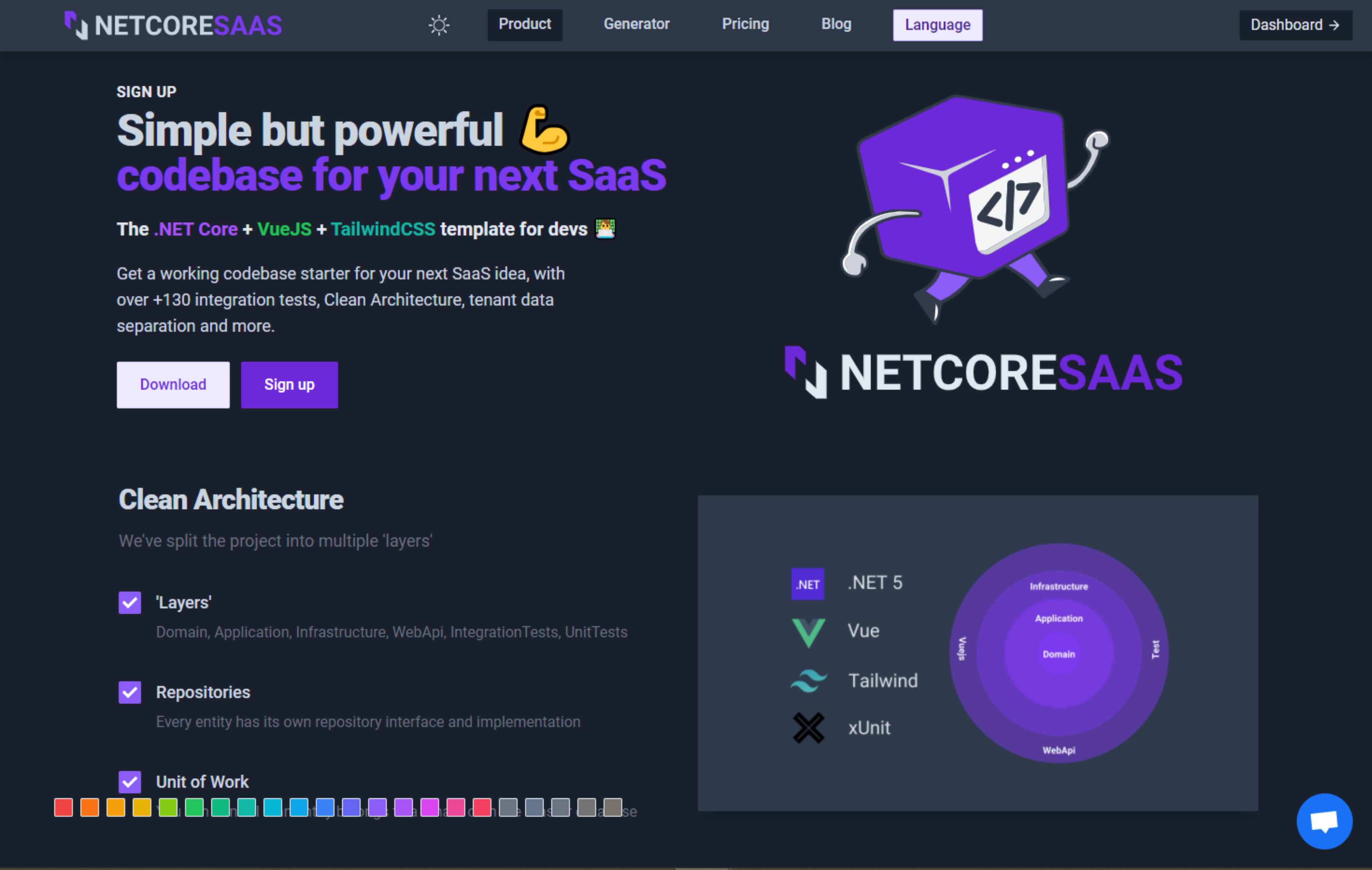
Organization settings page - App side:
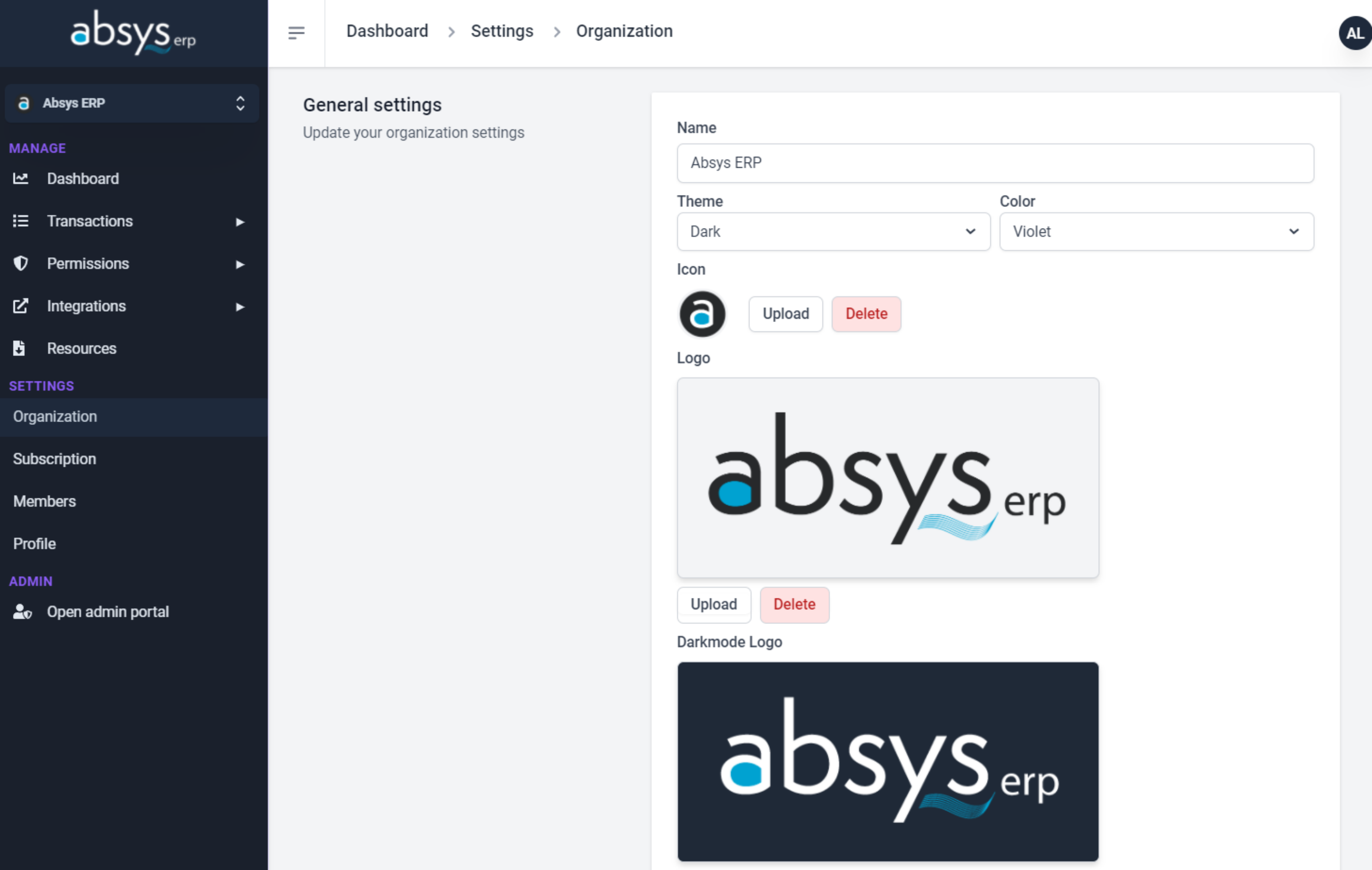
Desktop vs Web
I never got comfortable enough with my desktop designs. They felt forced.
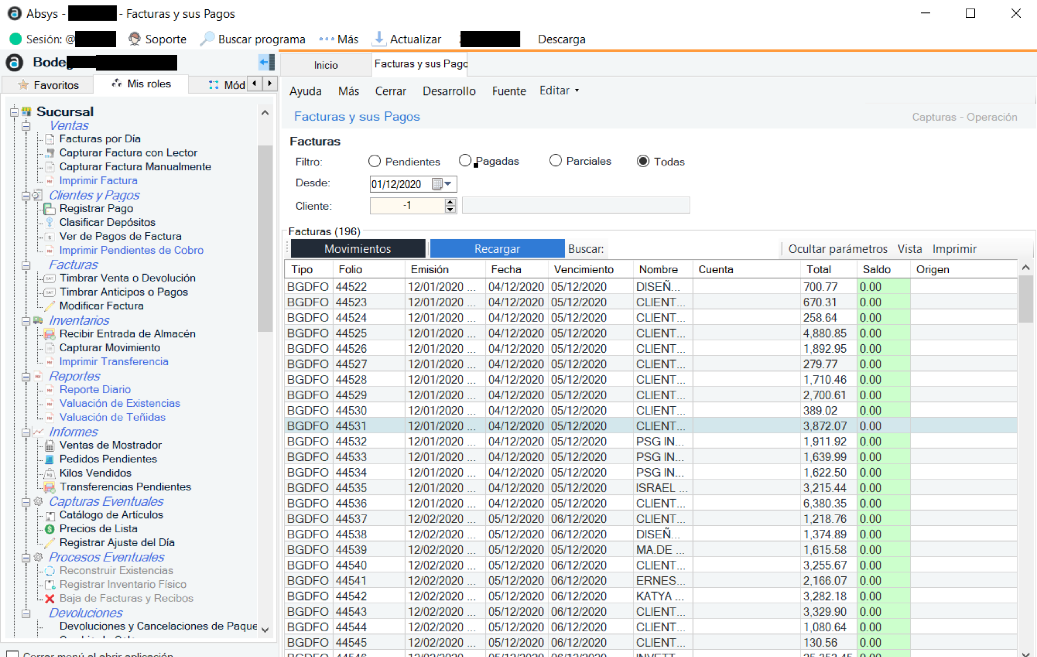
I will still be maintaining and developing some features here and there for my current desktop ERP application, but all my next projects will be on Vue or React + Tailwind.

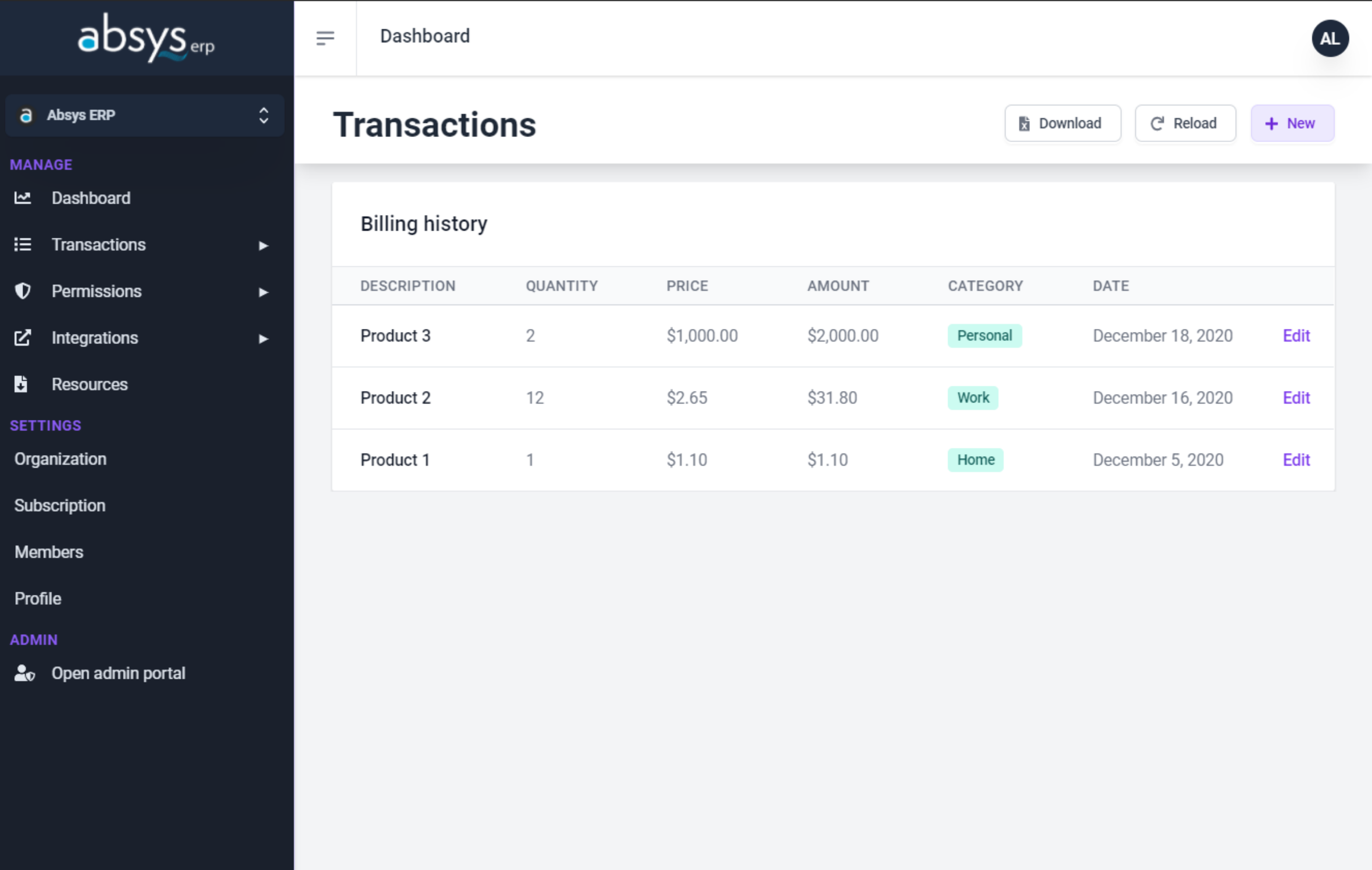
Wrapping up
With TailwindCSS, now I feel I can build high-quality components so I won't ever feel stuck, design-wise, as I felt with Winforms controls.
If you liked this post, follow me on Twitter or subscribe to the Newsletter for more 😃